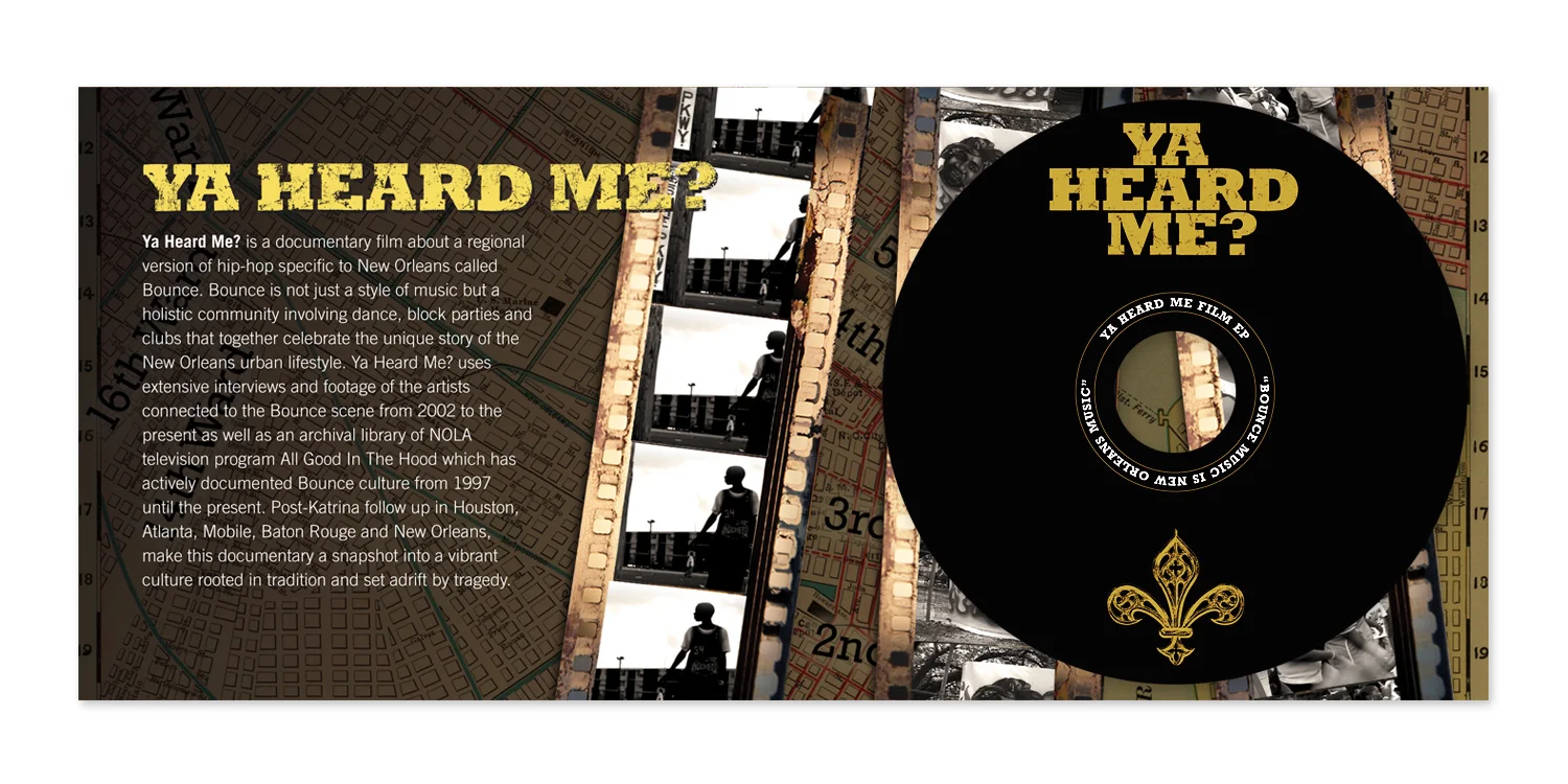
I wanted the YHM logotype to be bold yet weathered. The printed words, “Ya Heard Me?” were crumbled, submerged in water, and dried in the sun.

I wanted the YHM logotype to be bold yet weathered. The printed words, “Ya Heard Me?” were crumbled, submerged in water, and dried in the sun.
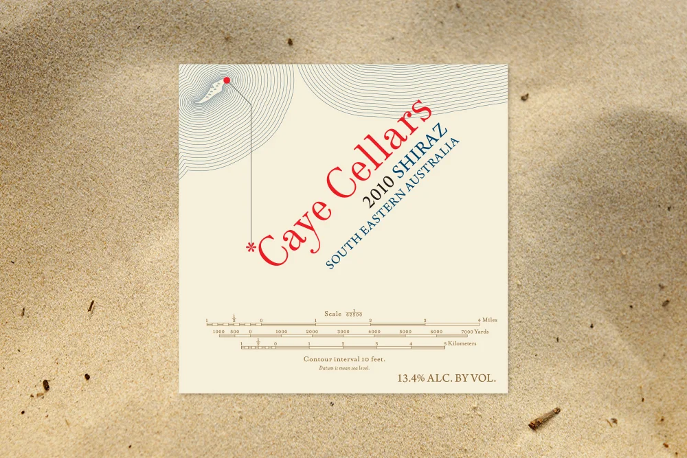
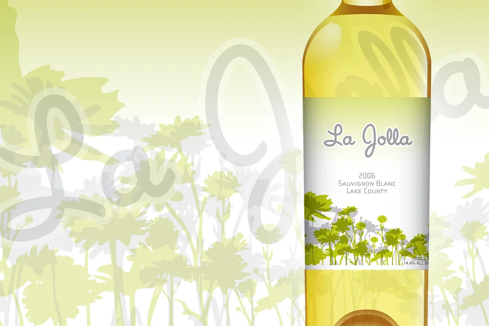
Many of my designs for wine labels utilize direct screen printing techniques. Spot colors are applied to the bottle, then fired in a kiln. Paint is baked into the glass creating an image that is bright, durable and able to cover 360 degrees of surface.
The vector illustration of Edina’s profile was recreated from a photo supplied by her parents. The Latin translation reads:
“FOR OUR PRECIOUS DAUGHTER, EDINA”.
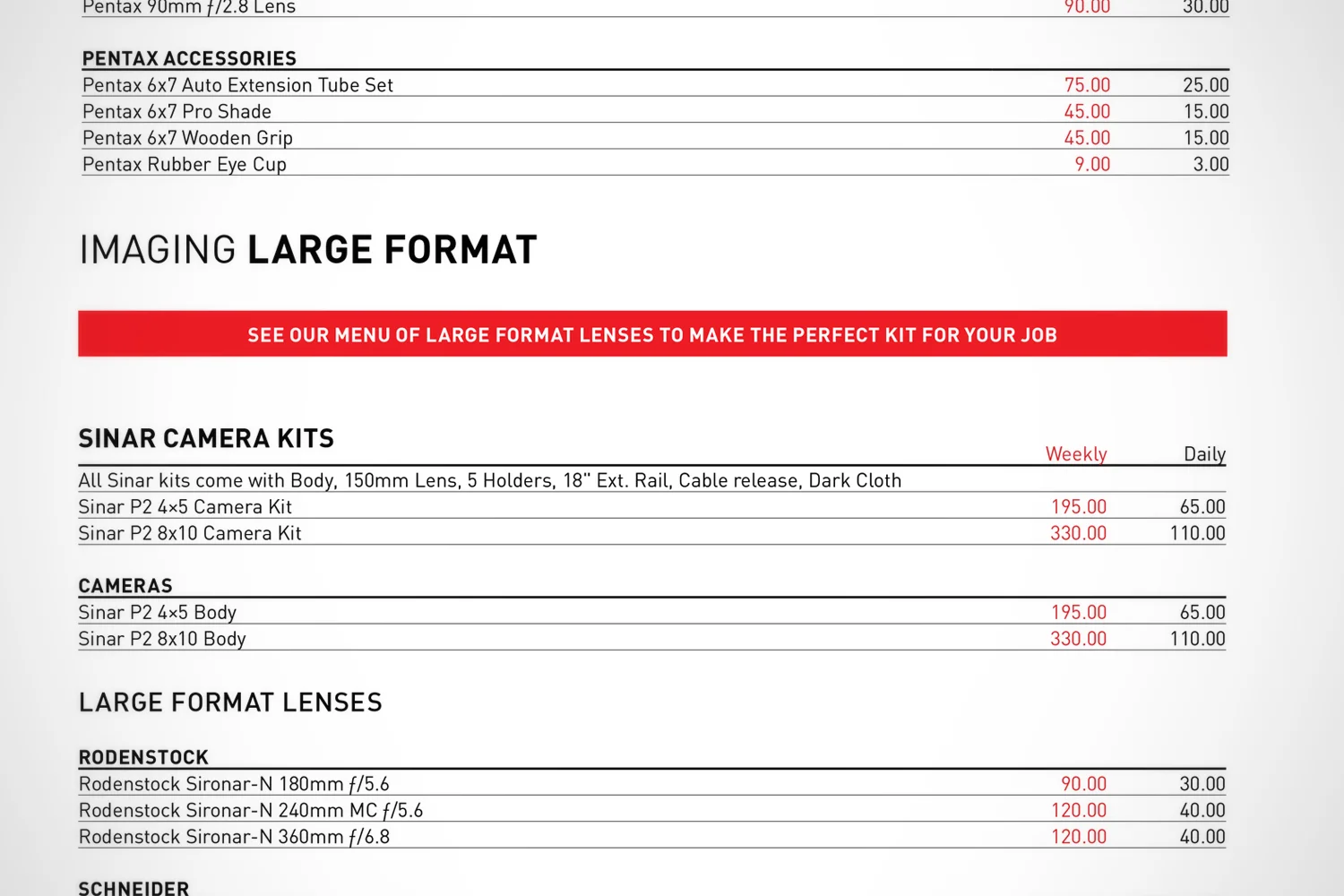
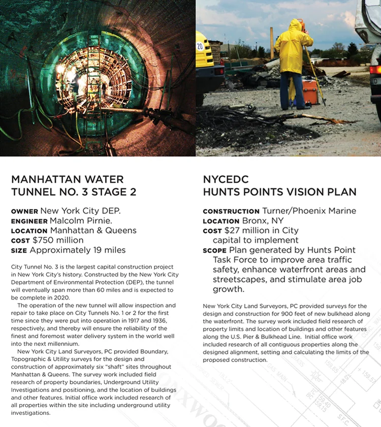
The brochure makes exclusive use of the DIN sans-serif typeface. Its legibility and uncomplicated, unadorned design, made it ideal for this text-heavy catalogue.
A successful building project starts with a precise land survey. The brochure for NYCLS is straight to the point with little flair or flourish — my goal was to communicate professionalism, reliability and confidence.
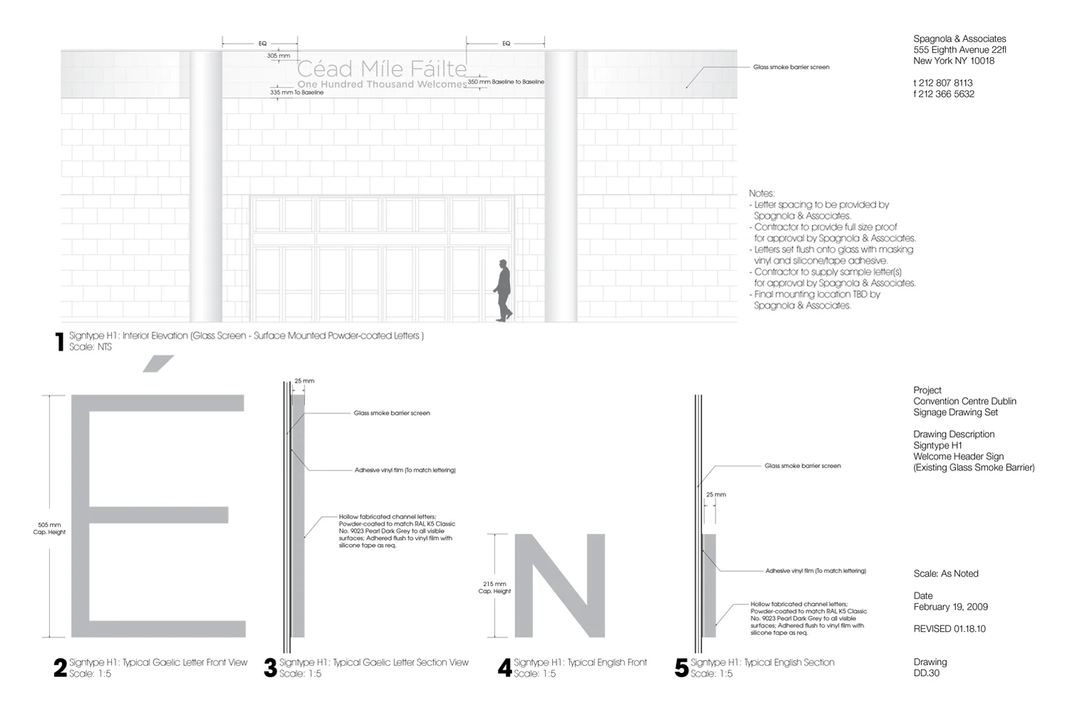
The signage bid for Convention Center Dublin involved highly detailed spec drawings for every sign and display in the building from the name on the facade to the emergency exits.
I oversaw the implementation of the minimal Spagnola & Associates website, which utilized subtle javascript transitions between the home page gallery and individual project pages.